
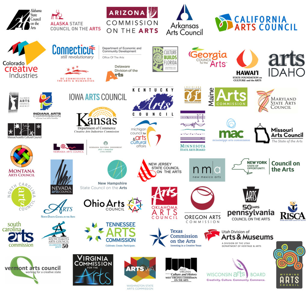
Responding to the announcement that the Maine Arts Commission was rebranding, we put together a survey to assess the quality of state arts commission logos from all 50 states and the District of Colombia. We received 90 responses and we’ve tabulated those results here for you. This informal assessment was meant to achieve a few things:
+ Looking at what’s happening in the field is good research. It can build a foundation not only for solid design but for critique and reflection. Research aids everything from the pre-design process (“Do we need to rebrand?”) all the way to the response of the final work and implementation by guarding against reactionary critique or baseless defense.
+ Well-researched and well-thought out dialogue goes a long way, especially these days. We were hoping that by offering an opportunity to comment on each and every logo instead of just rate them, survey-takers would feel empowered and enabled to think critically about what good design can achieve. It’s incredible how quickly one can gain vocabulary and articulation through patience, immersion, attention, and thoughtfulness.
+ Assessing the logos on their own merits helps keep the conversation from veering into unnecessary comparisons, reactionary choices, and lack of vision. It helps us illuminate what we like and don’t like and what elements of design we’re drawn to an why. It shows us that art and design do not exist on a spectrum from “bad” to “good”, but rather that they can stand on their own as reflections and bolsters of place, time, community, and process. (Or not.)
+ The process of implementing design is just as important as the design itself.
We’re grateful to Edwige Charlot, artist, strategist and designer, Creative Approach co., for initially bringing this to our attention and inspiring this inquiry, which has elicited a number of thoughtful responses and energizing conversations started by some very smart artists in our community. We’re left with some lingering questions: who is the audience for these logos, what are each agency’s goals in using them? What design standard contexts should be used to evaluate these — other governmental agencies, educational institutions, or arts organizations?
Below you’ll find the final average score for each arts agency logo, listed from lowest scored to highest, as well as a sampling of comments from the survey indicative of the overall feedback for each logo. We’d like to continue this conversation on design and process in the coming months — let us know if you’re interested in participating by sending us a quick email at info@thechart.me.
Thanks,
Jenna Crowder & Nat May
Some findings of note:
Survey takers came from 13 states: California, Connecticut, Iowa, Maine, Minnesota, Montana, New Hampshire, New Mexico, New York, North Carolina, Rhode Island, Vermont, and Virginia, with the densest concentration (44%) from Portland, Maine. The logos people were most divided on include Alaska, Idaho, Maryland, and New Mexico. Hawai’i was a near-perfect bell curve. Only 12 states earned a score of 5 or more, with a mere two states scoring over 6 out of 10 points.
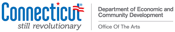
51. Connecticut Office of Culture and Tourism: 1.967
“Looks like a (bad) logo for a political party + is way too complicated and has too many levels of information.”
“Looks very republican.”
“Half of this would be fine. Also I hope Connecticut wins its Senate seat.”
“Looks like a local election sign: ‘Vote John Connecticut for Probate Judge 2016’.”
“Selling insurance?”
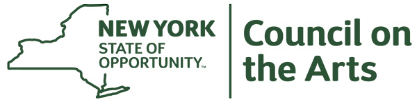
50. New York Arts Commission: 2.722
“Come on, man. There are lots of good artists in NY. Who did this?”
“Really disappointing, with all the AMAZING designers at their fingertips — hello?”
“The state that supposedly has the most concentration of artists in it? This is the most boring of all — partially because it has actually tried to convey info, but totally failed.”
“Bureaucrats. And this from a state where everyone once knew who NYSCA was. NYSCA was a great example of an acronym not confused with other things, which could be spoken out loud — “nis-ca” and has been around forever. And I’ve heard that there are some good designers in NY.”
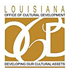
49. Louisiana Office of Cultural Development Division of the Arts: 2.878
“It’s certainly working on my own OCD. Why are the letters different sizes in the middle? Why is there so much to it? Ugh. Gold is nice.”
“Loopy and droopy.”
“The type treatment of the ‘OCD’ is pretty bad. No real tension or quality of form. Mostly is imitating a look but not well. The grid is ok otherwise.”
“Not scalable, not iconic, cliché script type.”
* Louisiana’s logo was difficult to find in a large size or high resolution, so this one is blown up for readability’s sake.
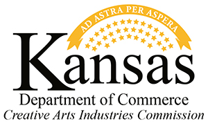
48. Kansas Creative Arts Industries Commission: 2.922
“So much clutter!!!”
“Hardships? Just b/c this is a state motto doesn’t mean this should be the logo.”
“Too busy. It’s like they put a logo in a rock tumbler. So many things for the eye to focus on.”
“Ooh, Latin! I’m into that. Especially from a state that seems to have lost all its marbles lately. But once again the arts are part of industry, and a subset of the Dept of Commerce. I know this may be the case, but you don’t need to say it. In fact you shouldn’t. Arts need to be supported for themselves, not because they are part of an ‘industry’. This is the machinery of the monetization of culture.”
“Works for the many words they have to fit in it.”
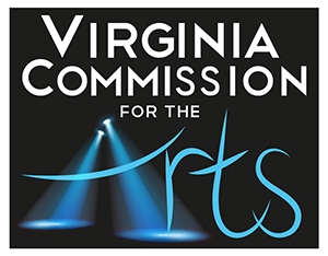
47. Virginia Commission for the Arts: 2.933
“This is one of the few that really says ‘arts’ but it’s tacky.”
“The spotlight is cool. Dramatic.”
“Some effort here but off somehow. I think both fonts could be more wisely selected and it could work.”
“Awful. Disgusting typography. Hackneyed image. Virginia is not a backwater, so why is this so terrible?”
“HOLY CRAP! WHAT IS HAPPENING? The arts are paintbrushes and splatter paint and things you hang on walls and weird Vermont swooshes. This has shaken me to the core.”
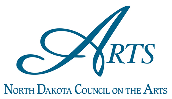
46. North Dakota Council on the Arts: 3.011
“Ornate type, no image, bland color choice. Not inspiring.”
“Font feels specific to the symphony.”
“The word ‘arts’ ≠ a logo.”
“Classic, if not super interesting.”
“Boring but well executed as a classical typographic composition.”
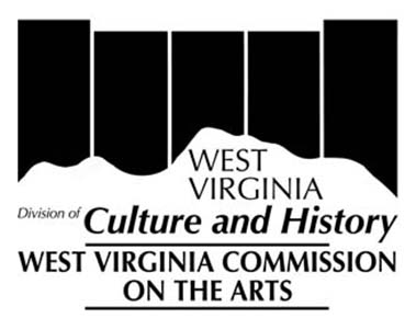
45. West Virginia Commission on the Arts: 3.056
“Couldn’t afford any color or banned it as too exciting and sexy.”
“Weird fonts, but it’s cool that they’re into Black Flag.”
“Logo on top I like, BUT way too wordy. Stripes could be colors for some applications. I like that it references the mountains.”
“Ominous 2001 reference in the background. Is that monolith made of coal? The state name is repeated! Bureaucratic. Ugh.”
“The air is black in West Virginia because coal.”
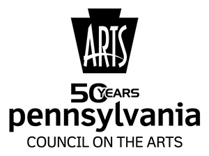
44. Pennsylvania Council on the Arts: 3.067
“I’m gonna give them a pass on the Disney Space Mountain logo work with the 50 years thing, the rest is ok. The ARTS is oddly squeezed into that keystone. Also — a keystone holds up something, and the Arts are a negative force in the middle of it weakening this essential architectural detail which will surely lead to collapse, so in that way, it feels like a negative.”
“The arts seem entombed here in Pennsylvania.”
“You just have to use at least one color in addition to black and white if you are an arts agency.”
“Actually when you take away the text and just use the logo at the top I think it works, I immediately thought ‘keystone state’ even though I don’t know much about PA. It could stand on its own.”
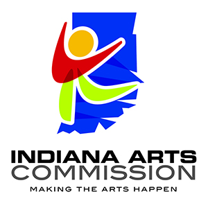
43. Indiana Arts Commission: 3.078
“Points for color; negative points for pretending artists are toddlers.”
“Biggest word: ‘Commission’. Also the logo reads ‘children’ and that is a typical trap that governmental officials fall into when thinking about the arts. ‘It’s for kids!’ Wrong.”
“Makes sense. Effective. Colorful. Includes a person, some expression/emotion/joy, and the state itself.”
“Looks like it was made for an Olympics in 1994.”
“The 80s called and they want their logo back.”
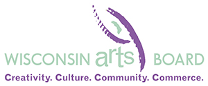
42. Wisconsin Arts Board: 3.178
“Reach for the stars you fairy dust rider!”
“Everyone is tired of swooshy things that look sort of like people.”
“What is with the Dixie cup Jazz references?!? Yuck. Plus — ‘commerce’ in the tagline is missing the boat.”
“Commerce. These are the muted tones of commerce.”
“The weight disparities on the type is super clumsy and distracting. The ‘arts’ treatment is forced.”
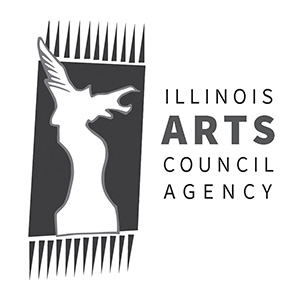
41. Illinois Arts Council Agency: 3.378
“Whatever — some stylized piece of large sculpture from the Roman era with some shapes around it? This is the sad reality of what the general public thinks ‘art’ is.”
“What is this? Am I supposed to see something? It’s an aggressive angel? Why the wolverine marks? Why don’t they line up correctly. Ugh. I hate it.”
“Strong image, fiber arts, sculpture; no other arts in here though.”
“Is that an eagle attacking the knight from a chess set?”
“A dragon trapped in a comb.”
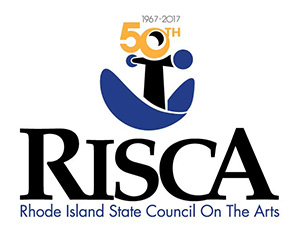
40. Rhode Island State Council on the Arts: 3.433
“Risca Business!”
“Sad. As the home of RISD and such a great little capital. Busy and wrong.”
“Is this some kind of weird person in a blue boat?”
“Looks like a logo for a maritime museum.”
“Good use of the acronym. Obviously a special occasion logo, so they have extra info to cram in there. But not bad given that.”
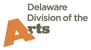
39. Delaware Division of the Arts: 3.533
“While not visually unappealing, this crooked ‘A’ seems to imply the Arts are just hanging on. And the word ‘division’ is miserable in this use.”
“Dynamic. Type treatment is not bad. The interplay between the ‘A’ and the rest of the mark could be more prominent and intentional.”
“Someone fix that ‘A’. #brokenwindows”
“Its fine, but don’t like the different fonts (three different ones in one logo??), and the hanging ‘A’ seems like the arts are hanging on by a thread in Delaware.”
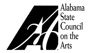
37. (tie) Alabama State Council on the Arts: 3.567
“Not terrible, if you give it credit for being from the 90s (please be from the 90s). Classic GD101 type juxtaposition.”
“I get it: normal A Alabama; fancy A arts.”
“I don’t think ‘typography’ when I think Alabama, but at least this logo incorporates an image that alludes in some way to things both contemporary and historical. Plus, no tacky colors.”
“I hope someone makes it to the center of the maze.”
“Nice movement within the shape — art, dance, music is in there.”
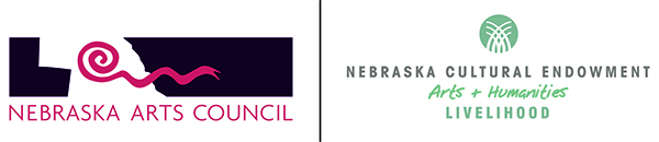
37. (tie) Nebraska Arts Council: 3.567
“States with a strong native cultural presence have an edge here…”
“Is this one logo? If so, it obviously has way too many words. And ending with ‘livelihood’. Ugh. Again with the monetization of culture. If you went with just the logo on the left, it’s not unattractive, but what’s with the snake reaching out to attack Iowa?”
“What does design mean? I like it.”
“Image and text are not at all dynamic and integrated. Suggests the org has difficulties with creativity, painfully compartmentalized.”
“Good use of space. The one on the left is strange and festive. Good contrast. The one on the right is clean and simple.”
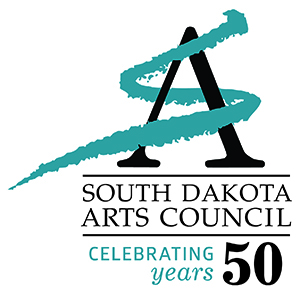
36. South Dakota Arts Council: 3.6
“Not a huge fan of the recurring theme of ‘artistic’ textured lines, but nice unity and flow between text and image.”
“Cheesy cursive/fake brushmarks are the WORST.”
“YEAH!! ARTISTS PAINT STUFF ON ANYTHING LIKE JUST PURE EXPRESSION — FEEL IT!”
“Typography is pretty good. The mark is not great but is probably fine. This whole paint stroke means art idea seems pervasive in a lot of these marks.”
“Could be nice with a little tweaking. It feels a tad cluttered due to the combined fonts and color choices…”
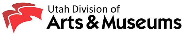
35. Utah Division of Arts and Museums: 3.63
“A division of a division. Too divisive! But type and image not terrible.”
“The typeface is very clumsy. The ampersand is really strained and painful to took at.”
“Cramped little squiggles, all huddled together.”
“Interesting symbol.”
“Waving flags? I wish this spoke more to arts in the image. And more contrast between the two flags, not just two shades of red.”
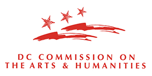
34. D.C. Commission on the Arts & Humanities: 3.778
“Optima! Swooshes! Stars! Perfect. Call it done.”
“A nice sense of movement and place. The image leads the viewer’s eye into the text nicely. There image is thoughtful—both flag and landscape.”
“At least the typography was done by a pro. And the image alludes to some artistic process (drawing or brushstrokes). It feels appropriate to the place.”
“I have no idea what that image is supposed to be. Bombs? Dolphins? Dolphin Bombs?”
“Typographic composition is pretty good but the its a lot of words that get a bit lost. Could have benefited from use of weight. The mark is fussy with all of its sketchy bits. Probably not great at small sizes.”
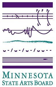
33. Minnesota State Arts Board: 3.789
“They get some points for creativity but ?????”
“Probably means a lot to those in the ‘know,’ but does not translate and may be off putting to the general public.”
“Though the color scheme is dated, I love the visual representation of different art forms in this logo. It’s inspiring in a way others aren’t—directly illustrating various mediums.”
“Extra points for making music the centerpiece here, and for using musical notation as the visual. It strongly states creativity through the notation. It gives a lot of real estate to the image, which might be just right.”
“It makes me feel like I don’t know enough to understand this logo.”
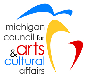
32. Michigan Council for Arts & Cultural Affairs: 3.889
“Tighten this up and maybe you’re on to something. Why lower case?”
“Horrible. Chill on the fonts and the poseur Calder designs.”
“Modernism of the early 1960s.”
“I have a soft spot for Michigan, but this is really disappointing as it is the home and hotbed (at times) of amazing design. I can tell you no one from Cranbrook designed this logo.”
“Calder shapes meet toddler primary colors. It is fun energy, I suppose — extra point for that.”
“Interesting use of primary color palette. It’s open and friendly. Good use of space and enough interplay between text and image.”

31. Missouri Arts Council: 3.9
“Again, the idea is neat, but the execution is lacking. Okay, the state is a picture. Did ANYONE look at how those lines were made? They really just chose the thickest setting of the line tool and clunked around until an approximation of the state showed up? I just can’t. A three not a two, though, because the ‘i’s in the font are mad cute.”
“Lead with the statement, guys! And the frame thing is silly, even if it does say what you want it to. But frames are so old-fashioned. Art doesn’t just hang on walls, you know.”
“Let’s see…what says art? Palette? No. **Worker comes in and hangs up fire exit sign.** Hold on, I got something.”
“Nice idea but poor execution.”
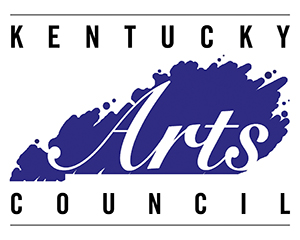
30. Kentucky Arts Council: 3.967
“Paint splatters, and italics, connote art. We get it.”
“Evocative of the state shape, paint, print. Others are so bad this looks brilliant.”
“Could debate the ‘paint’ effect on the state but the idea is clear the execution is good.”
“They don’t quite pull this off (the typography is odd), but is has all the elements: simple wording with ‘Arts’ front and center, something that identifies the state (word and image) and something that alludes to artistic process or product (‘someone spilled the paint, and look, it’s kind of Kentucky!’).”
“Color choice feels dated, but overall it’s balanced and hits the mark.”
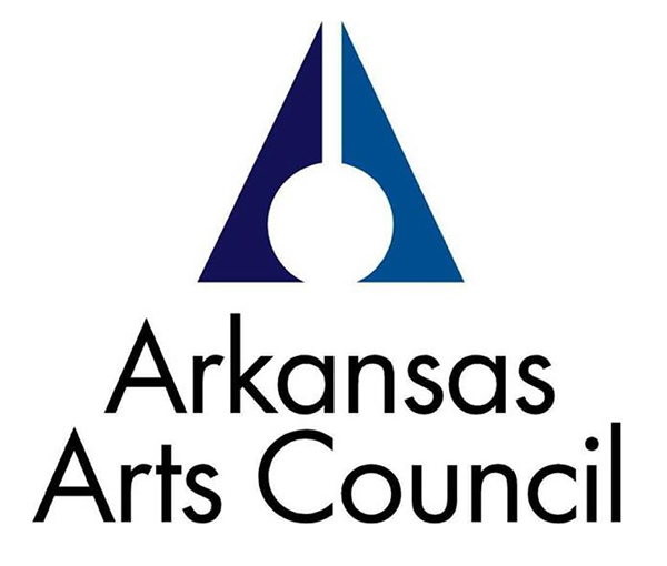
28. (tie) Arkansas Arts Council: 4.044
“Looks dangerous.”
“What does the design mean?”
“No idea what the image is. Trees and a skillet? And not abstract enough to not invite the question.”
“This is a map to the secret chamber of the Great Arkansas Pyramid. It must be decoded — and all booby traps avoided — in the lethal pursuit of state grants.”
“Nope. Pretty sure that’s an MS Word font and maybe I’m just sensitive post-election but that triangle with the circle in the middle looks like a hooded klansman.”
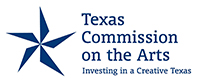
28. (tie) Texas Commission on the Arts: 4.044
“Somethings aren’t bigger in Texas.”
“Ok. Execution is not bad but the whole thing doesn’t quite come together as a single thing.”
“Who chose this graphic designer? There must be better in big Texas.”
“Simple. And here’s a tagline where the money part doesn’t bother me, because it is talking about putting money into the arts — ‘investing’ — rather than referring to the arts as an industry.”
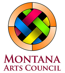
27. Montana Arts Council: 4.089
“Pie baking must be popular in Montana.”
“Hmm. Kind of celtic, kind of first nation. I’m a little confused but could be convinced.”
“Gorgeous.”
“I wonder if this is to be a basket weave? It’s almost rainbow but not quite. the maroon font doesn’t really work though.”
“Text does not connect with image at all, image I am sure does not read well at small scale. Not a logo.”
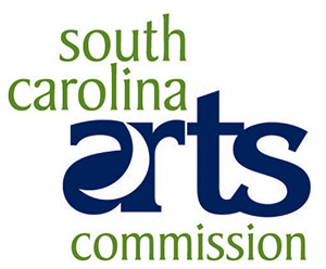
26. South Carolina Arts Commission: 4.122
“One of the more competent type treatments.”
“The ‘arts’ bit is trying very hard to be interesting but fails. Lacks balance and the ligatures are arbitrary feeling.”
“Good job, SC, creative without being condescending or cloying. I don’t understand the moon shape, but at least it doesn’t make me wince.”
“Hard to look at that a-r combo. A brighter color choice could elevate this design.”
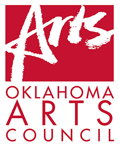
25. Oklahoma Arts Council: 4.144
“Futura has extended weights that might fill that second line less awkwardly than driving mile-wide tracking between all the letters.”
“The grungy ‘Arts’ mark is fussy. But the overall mark is ok.”
“Great! A bit reliant on text as script to convey artiness. Additional imagery or detail could help for depth of message.”
“Apparently crayons are a major part of the art scene in OK.”
“Redundant, pointless.”
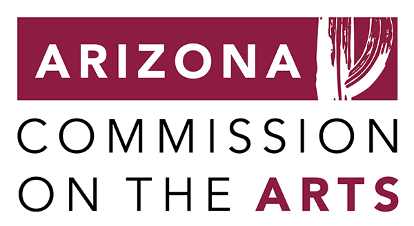
24. Arizona Commission on the Arts: 4.189
“Letter spacing is poor. Optical alignment of type to mark on top is poor. Cactus illustration looks very autotraced and lacks real distinction.”
“This is perfectly nice. It is uninspiring to me personally, but it is not offensive either.”
“Color says nothing about Arizona to me whereas I think of that Sedona red could really be put to use, those wind carved cliffs. At first I thought the brushstroke thing was ok until it looked like a Saguaro cactus (overused southwest symbol — a caricature).”
“Brushstroke cactus is a nice nod to place and arts.”
“Trying to accomplish the same color play as the Alaska logo (to highlight state name & arts), but to lesser effect. The cactus (?) image is strangely cropped & the block of color at the top compartmentalizes the elements of this design.”
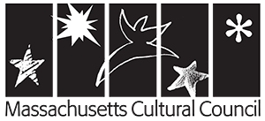
23. Massachusetts Cultural Council: 4.244
“I have mixed feelings about this one. On the one hand it represents different arts (performance, comic art, writing (the asterix), drawing, and through the five black rectangles, time-based arts like film/video and artists’ books. That’s a tall order. But it seems to rip-off Matisse, and what’s that starfish doing in there?”
“Looks dated and random, but arty and theatrical. I don’t like it but I am sure some people love it.”
“The mark is super cheap looking and arbitrary.”
“The variations on the stars are cute but tacky.”
“I like this idea very much..showing multiple ways of viewing one idea. It is lacking color though, and ultimately I’m not sure what starfish has to do with MA.”
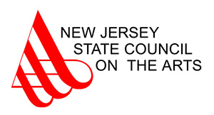
22. New Jersey State Council on the Arts: 4.333
“Really interesting and balanced mark paired with flaccid poorly spaced too-thin Arial. Really? You couldn’t use Helvetica?”
“Balanced. Good contrast. Love the way text becomes image. The red is striking, powerful. Evokes a musical note.”
“Reminds me of Bridge-gate.”
“Odd to use the ‘A’ here, instead of the ‘N’ or ‘NJ’. Weird letter spacing.”
“It doesn’t embarrass me, but it doesn’t scream art either. Unless you are a calligrapher, but if you were you’d probably find this embarrassing.”
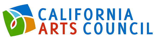
21. California Arts Council: 4.367
“Color! Translates well into black and white as well. May be difficult to use when a vertical orientation is needed or required.”
“Feels a little dated, but good use of color and a modern sans-serif.”
“Colorful and unified, but totally uninspired. Bad kerning in logo type is inexcusable.”
“Too bland for California.”
“Balanced, distinct, sharp, creative.”
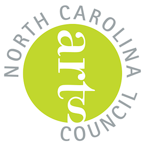
20. North Carolina Arts Council: 4.4
“Pop of color. Organic design. Plays with the idea of slant and skew in a graphically pleasing way. Like a nonliteral radiating sun or a blooming flower.”
“OK, they tried here. Some creativity. They break the normal formal qualities of the logo (a bit). Also nicely implies that the arts can’t be contained by the bureaucratic form, which I like.”
“Like the state itself, I’m not sure what direction it’s heading.”
“I actually like this one. Maybe because of the color, but it feels in motion and the green dot could work on its own.”
“Text flip is too severe and distracting from message.”
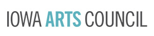
19. Iowa Arts Council: 4.422
“Not tremendously inspiring, but clean, effective, and nice color choice. Legible and appeals to a wide audience.”
“simple simple <3”
“Simple AF.”
“Clean and balanced, a little dry.”
“I prefer this to a meaningless image.”
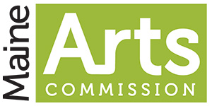
18. Maine Arts Commission: 4.444
“Horrible typeface. Horrible kerning on commission…looks like c o mmission. Maine on its side is hard to read. Nothing about this logo says Maine. Lazy, lazy.”
“Maine should include something of its maritime or woods heritage.”
“Not really a logo as much as an uninteresting composition of words. Using a typeface that was trendy like 10 years ago for its distinctiveness is a bad idea. Looks dated already. The color is also trendy from years ago and doesn’t speak to anything about Maine or art. I agree with [the] sentiment that it looks affiliated with the Maine Magazine brand which indicates that there was insufficient research.”
“Very clean but could be for anything.”
“I like the little connector, and the font is clean and modern, but it lacks spark and thoughtfulness.”
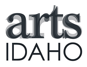
17. Idaho Commission on the Arts: 4.544
“No extraneous words, yeah! And they’ve used the shortness of the word “Arts” to go to a larger typeface, and the three layers feels strong and yet a little subjective. I’m sure someone on the committee wanted a big potato in there somewhere, but they chose right.”
“It’s fun to copy the Contemporary’s logo, but make it not quite as good.”
“No. Am I having a seizure? Could the designer not decide what font?”
“Simple. Clear. Bravo!”
“I assume this doubles as an eye chart? Still not awful.”
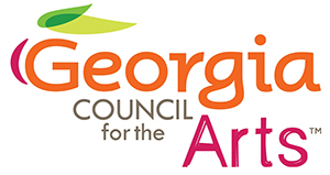
16. Georgia Council for the Arts: 4.556
“Too many ideas in one place. The peach thing is interesting but the execution is not great. But then why the grungy ‘Arts’ thing also. The type on ‘Georgia’ is also clunky and mismatched. The weight of the ‘G’ is too light.”
“Cute but looks like a yogurt brand.”
“Colorful, fun, non-condescending. Was going to give it a 9 until I noticed the weird creative attempts with the Arts double-layering, plus the TM rubs me the wrong way.”
“Simple & clear.”
“Colorful and more cohesive.”
15. Florida Division of Cultural Affairs: 4.578
“This one looks like a lot of thought went into the design. Dislike the trademark. Close up of a fern does not scream Florida to me.”
“An actual positive, supportive message with creative local flora references. Still kinda boring in the larger picture, but for this assemblage of logos a high ranker.”
“A statement logo with a good message. More important than the name of a governmental department. And the image alludes to nature, and photography (think Blossfeldt or Renger-Patzsch, neither Floridians), as well as to architecture and perhaps even movement.”
“Subtly challenges stereotypes of Florida.”
“So busy! And it’s a downward spiral? Would not read well if presented in small scale.”
14. Oregon Arts Commission: 4.944
“One big ZERO.”
“Ok. Generic but executed well enough.”
“Interesting mark, stale type.”
“The image is also text (a big O). Flowing and welcoming.”
“Playful and deceptively simple.”
13. Maryland State Arts Council: 4.966
“I like this. The titling is straightforward. And the image is the first I’ve seen that alludes to movement, thus including dance, theater, and performance into the logo. It also gives a nod to textiles arts. Nice job.”
“Hell yes. Classy font, an abstract of the state flag, the movement in the graphic implies brush strokes, sheet music, dance…way to go Maryland.”
“Interesting and dynamic. I suspect the details of the mark are too fussy for reproduction.”
“Gracefully corporate looking.”
“Simple, elegant, strong, tasteful. I like the curves — feel like movement, brush strokes, music bars, etc.”

12. Ohio Arts Council: 5.0
“I feel like I’m not getting something the designer intended with the logo. Is it like a wagon wheel/midwestern/prairie kind of shout out? Either way, props for that cute capital a with the swoopy like that mimics whatever is happening in the graphic on the right.”
“Thoughtful. The ‘A’ in arts echoes the curvature of the circle; a nice way to connect type and image. There’s something jarring about the image—a cutting into the circle with these sharp lines…but I do think it’s successful.”
“Not bad. I don’t really care for the image, but I see what they were doing here. But it’s not wordy, and they emphasize ‘Ohio Arts’ over ‘Commission’.”
“At first I hated that rainbow dreamcatcher, but after looking through these, I appreciate the typography more and more and am willing to overlook that color thing, because arts orgs rarely print in color anyway.”
“Consistency of text color and message. BAM!”
11. Mississippi Arts Commission: 5.1
“I am a sucker for off center stacks of circles, though the color scheme would work better for an environmental agency. Yet primary colors are over played…it’s tough, I sympathize with the designers.”
“The first acronym I remember seeing in the survey, but ‘MAC’ stands for so many things. Wouldn’t ‘Mississippi Arts’ be a great name? I like the simple typefaces, the use of lower case on the full name, and the color. But given their reputation for being at the bottom of education in the nation, I would think the state would not use a child’s scribble in their logo, even if it does work graphically.”
“It could be a logo for a diaper company, but it is simple and iconic, so that’s good.”
“Points for simplicity. But not too many points. Lose that ‘mac’ type.”
“Nice use of a small scribble and good colors.”
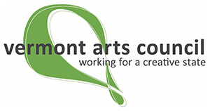
10. Vermont Arts Council: 5.14
“Love ‘working for a creative state.’ Clear mission. I like the interplay between outline and color. Another take on drafting, which I think has impact. Organic, which speaks to the state and the council.”
“Almost in the 9 camp. Nice font, color, and unique shape, plus inclusion of a tagline. Just a little shy. The kerning in ‘creative’ doesn’t help — that ‘t’ eliding into the ‘i’ makes me twitch — but I think another highlight color in the green shape (thin orange line?) would have jumped it to a 9.”
“Nice. Movement, fluidity, green. Nice tag line.”
“Overall not bad but I suspect the mark overlapping type with that color scheme causes all sorts of readability issues on certain media.”
“Creative and with movement. Good simple font, inviting lowercase.”
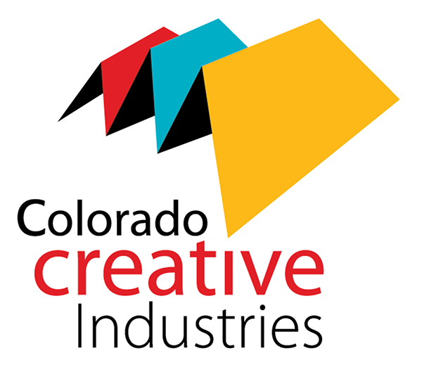
9. Colorado Creative Industries: 5.322
“The mountains are Colorado-y, but seems to be made out of paper…they might also be tents. Sheltering and protecting and incubating artistic endeavors. This feels like what the name of the org says it is, and seems effective.”
“Good color & contrast. Wish there was more interplay between text and image, but there’s a movement here that’s absent in a lot of other logos.”
“I might have given this a higher score if last week I hadn’t perused a graphic design website that had many iterations of this offered up as business logos. For $25, I might add.”
“Nice name for a change. Emphasis on Creative, and I like the use of Industries as well. And the mountain image, despite the fact that it creates a big ‘M’ (for mountain?), feels contemporary.”
“The mark draws the eyes and the color scheme is nice. The type treatment is bad. ‘C’ in Colorado is too heavy. Mixed use of the case and weight seems arbitrary. The relationship to of the type to the mark is also arbitrary. Not very connected.”
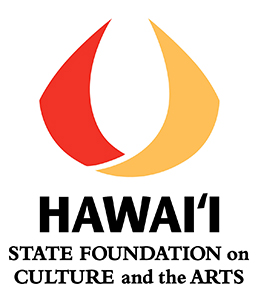
8. Hawai’i State Foundation on Culture and the Arts: 5.4
“Solid. Evocative of culture without being offensive, even in the sans-serif choice.”
“The font is a little heavy and I wish there was more interplay with the image, but the image itself is warm, flowing, and welcoming. Wish the lower text had stuck with a sans serif and scaled down to make the overall logo more balanced.”
“This might reference something in Hawaiian culture, but I do not know what it is. Decent color, but the serif all caps at the bottom undoes that.”
“Symbol has no evident tie to the arts, could be for anything.”
“Typography is pretty good. The choice of typefaces is also interesting and has a lot of character and pairs well with the mark.”
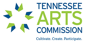
7. Tennessee Arts Commission: 5.644
“This one has a sunny, positive feel. Hard not to like.”
“Clear tagline. Nice take on a starburst. Lively colors.”
“Colorful, energetic, and it gets in a tagline/mission. You’re up there, TN.”
“Reminds me of Appalachian quilts, works well.”
“Simple and iconic.”
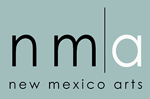
6. New Mexico Arts: 5.656
“Nice and clean, feels like New Mexico without co-opting culture.”
“Ok, this is clean, contemporary and would work for many things but it says nothing about New Mexico arts, the rich culture, history, legacy, landscape. Color is wrong. I gave it a 5 because it is clean typography.”
“Nice and clean, good color of mesquite.”
“I don’t get the line. This leaves me feeling like I’m out in the desert with too much space around me…maybe it’s actually a genius font, after all.”
“I really like this one. Simple and to the point.”
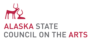
5. Alaska State Council on the Arts: 5.689
“Love the moose. Love that ‘Alaska’ and ‘Arts’ are the same color so they stand out as their own phrase. Really good.”
“Hey! That’s pretty nice.”
“Strong font and color scheme, animal graphics convey sense of place and the style they’re done in is a nice nod to the state’s native art traditions.”
“Illustrates place and arts. Simple. Legible. Good use of color.”
“Mark is made well. Feels like a contemporary expression of heritage.”
“My favorite of all. Instantly recognizable, appropriate to place.”
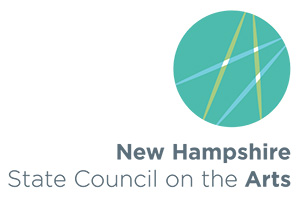
4. New Hampshire State Council on the Arts: 5.711
“Points for Gotham and simplicity.”
“I love the way light is created at the intersection of these lines. Evocative. Good color choice. Clear text.”
“Who’da thunk that I’d be rating the Live Free or Die so highly? It has energy, non-cloying color, and a nice use of fonts to highlight their name/focus.”
“Simple and not bad overall. The typography could be better thought out to not be sprawling off to the left. But generally ok.”
“Not bad. The logo is abstract enough to imply dance or drafting, etc.”
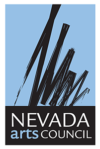
3. Nevada Arts Council: 5.789
“For yet another symbolic reference to paint strokes, this one is actually pulling it off ok. Though their designer has never heard of kerning, it seems.”
“What’s happening to me that I like this.”
“Bold, creative, focused. Thumbs up.”
“Nice ensemble. And the abstract design might be an N.”
“Nice. The image reads ‘art’, has movement, ‘brushstrokes’, looks like a signature. And the image and text are well-integrated.”
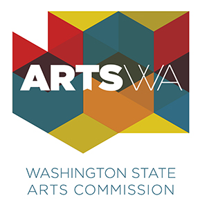
2. Washington State Arts Commission: 6.756
“These geometric patterns are overused, but I think work well for a logo like this. They translate the peaks in the ‘w’ into something visual. And evoke the idea of building something together.”
“Ooh, very nice. Color, pattern, integrated text. Stands out on a poster. My fave.”
“Interesting, lively, Details on the type pair well with the mark and echo the angularity.”
“Colorful and big. Nice and substantial.”
“By far the most interesting for its simplicity and form.”
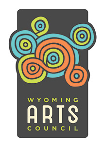
1. Wyoming Arts Council: 6.844
“This one has a successful combo of color, font choice, image, and effectiveness. Not sure what the image is, but it’s pleasing at least.”
“Captures the essence of Wyoming. Good color choice. Has a nice weight to it, while also appearing welcoming and open. Good, clear typeface.”
“This isn’t my taste, really, but it is a solid and fun logo without being condescending or getting into toddler category. Colors, shapes, fonts are all good.”
“Wyoming, you funky!”
“Beautiful, well designed, reflects what it’s about.”
With the results in, it’s hard not to look at the the former Maine Arts Commission logo and wonder why they felt the need for change. The former logo, designed by Stacy Kim and shown below, is still in use on the Maine Arts Commission website, as it seems they have not full transitioned over yet. (The logo launch was announced in a November 30th email newsletter.) What do you think of the change?
![]()

Jenna Crowder, Co-Founding Editor at The Chart, is an artist, writer, and editor. Her writing has been published in The Brooklyn Rail, Art Papers, BURNAWAY, Temporary Art Review, The Rib, Liminalities: A Journal of Performance Studies, and VICE Creators Project, among other places.