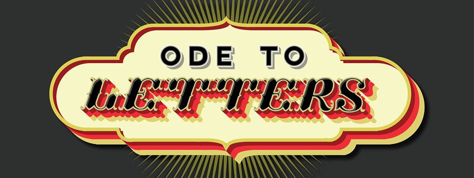
Engine blends disciplines in Ode to Letters.
by Ian Carlsen
Information and style intersect in Engine’s current show Ode to Letters: a declaration of love of letterforms. Co-curators Ryan Adams and Will Sears have assembled a robust show that speaks to how much presentation defines the information we process. Letters are a common theme here, but how each artist manipulates what is within and around these letters is the real delight of this show.
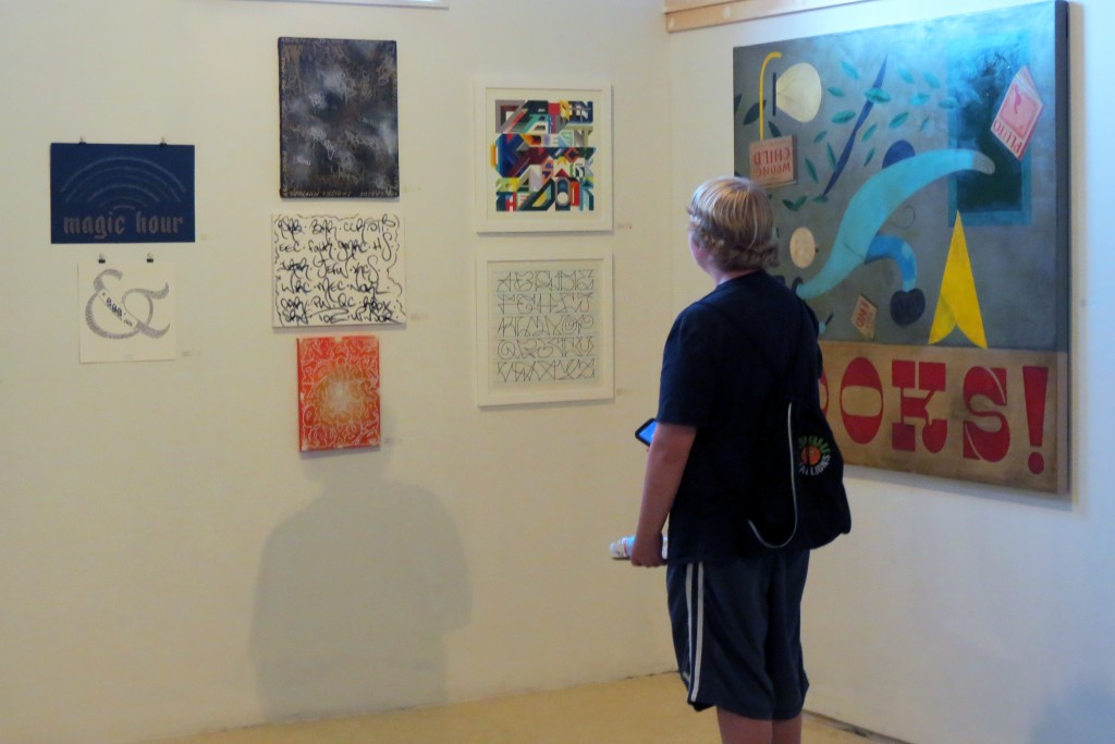
Engaging, and at times insidiously mundane, the work in Ode to Letters springs forth from everyday places. Placing sign-painter Curve’s simple, legume-centric, street vendor sign next to a boastfully calligraphic graffiti piece (both Greg Lamarche and Noah stand at the top of this pile for sheer meticulousness) or Josh Luke’s deftly impressive typography, dredges up questions of voice and intent. This sign, the show seems to suggest, isn’t just telling you about these nuts. This sign is selling them to you.
Ode to Letters celebrates style and technique, and in doing so, also showcases these elements as tools. One piece flows to the next without much incident, leaving the viewer to constantly assess: is this signage? Is this graffiti? And the more each question is asked, the blurrier the lines can become. Graffiti artists can present formalized art. Graphic designers and sign-makers can play with graffiti. At some point the artist becomes irrelevant.
Alphabet 2.0, an impressive piece of style co-optery by artist Mike Rich, seems to exhibit this idea well. Stealing methodically and boastfully from a multitude of sources — the Portland Sea Dogs, Walt Disney, and the Book of Kells to name a few — Rich implies a chameleonic type of possession. Your style is his style, be it a typeface, a logo, or an aerosol tag. To copy is to conquer.
The show is not without its lighter moments. Pat Corrigan’s finely inked illustrations spring from a storybook that begs to exist. The artist Snoeman hits a defiantly un-P.C. note with his Snoeman A–Z, which features a bleakly humorous series of grotesques, contorted into the shape of letters. And Matt W. Moore, offers an affirming message in his signature vectorfunk style. One patron at the opening was quite proud of deciphering Moore’s Opportunity Doesn’t Knock, It Answers the Door, tracing the air vigorously in front of the image with his finger to show where the words were.
Similarly, both Adams’ and Sears’ contributions obfuscate their text. In Down and Out, Sears arranges a cut-up mosaic of hand-painted signage, distorting information, reducing it into sharply overlapping chevrons in a vibrant color palette at times reminiscent of a Hartley Elegy-era Robert Indiana. And while Sears’ work seems comfortable in a gallery setting, Adams’ Nothing Costs Nothing — a sharply angular web of deep blues and grays — straddles the line between the gallery and the marketing boardroom with an unwavering confidence. Using carefully orchestrated bevels and highlights to capture and guide the eye, Adams, with great talent, incorporates his title verbatim into the piece, hiding the truism almost in plain sight.
Two artists make use of freight car “reporting marks” — acronyms such as AOK, LVRC and UPFE — in some of their works. The Solo Artist takes theirs to a minimal extreme, executing the acronyms in simple, rolling strokes of black oil bar on white canvas, rendering the banal set of letters with loving respect and seemingly unintentional irony. Taking a more proprietary approach, the artist Learn fades and layers dozens of reporting marks inside a large, lightly-serifed, graffiti “L,” imposing the structure of one letter—assumedly the first letter of his graffiti name—over the dense, list-like record underneath.
The inclusion of outsider art is Ode’s greatest merit: these works mirror and mock the techniques of the more technically advanced artists with a refreshing honesty. They demand attention, comment, and steal without any sense of tidiness. In turn this allows us to see, as it were, the process, and perhaps the motivation behind the more benign disciplines of sign painting and digital typography. Ode to Letters provokes thoughts which travel with the viewer well outside of the gallery walls.
Ode to Letters: a declaration of love of letterforms continues through September 19, 2015.
Engine
128 Main Street, Biddeford, Maine | 207.370.9130
Open Tuesday–Friday 1pm-6pm, Saturday 11am-4pm. Free.
Ian Carlsen is a freelance writer, actor, and amateur ornithologist. He has lived in Portland for more than a decade.